Wednesday, December 16, 2009

Mayor Patrick Hayes Award


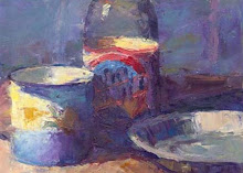
Still-life with Snapple

I am very excited to announce that I just recently received the Mayor Patrick Hayes Award for a piece I did entitled Still-life with Snapple. This award came from the show "Reflections in Pastel" put on by the Arkansas Pastel Society. I have received recognition for Still-life with Snapple several times which actually is a surprise for me. I often feel that it is difficult to predict what work will be successful. I think that is what makes the art making process exciting and unpredictable.

Monday, December 7, 2009

Ventura Beach Series

A number of experiences this last summer provided inspiration for a number of paintings I have recently finished. Each painting has focused on the interaction of summer light on the environment. These paintings attempt to express the dynamic visual patterns created in strong sunlight interacting with buildings, landscape and people. The paintings attempt to capture the unique qualities of early morning light as well as that which is found in the brilliance of the afternoon.


Porch with Light
The face of this house although painted an off white, suggested for me an array of color hidden beneath the surface that was freed by the morning light. Was the off-white of the house really bluish or reddish in color. I seem that it was made up of both. In part my goal was to give to what seemed a simple isolated house a personality created by its own visual make up. The side bushes with their sharp angled leaves created a striking contrast to the straight and simple lines of the entrance, doors and windows. Although there is an inherent humility to the house, it is configured with a simple beauty made evident in the clear morning light.


Porch with Bench
Morning light has always attracted me visually and psychologically. The angle of light early in the morning always interacts with the environment dynamically creating shapes, angles and brilliant color. A bright clear morning always suggest the newness of experience with a renewed sense of discovery. One early morning in Ventura , I was attracted to the interplay of light on the downtown buildings. As I drove around a number of interesting compositions caught my attention. Although this building with porch seems simply enough I was intrigued not only by the configuration of the shadows, but by the deep intense colors within the shadows themselves. It was as if the light had painted itself a deep bluish purple as it intersected with the covered structure.


Reading at the Beach
As Mike sat reading in his beach chair, he seemed to become part of the environment of beach goers wishing to relax their lives for a few hours at the beach. I painted him as a part of this environment. My goals was to utilize the umbrellas, towels and clothing to create a composition of interconnected colors and shapes. The strong colors suggested to me the bright sun that would either reveal the inherent intensity of the objects or create the contrasting shadows. Mike seemed to act a contrast as he relaxed amid the interplay of color, shape and shadow.


Ocean View
One day this summer we took a family trip to Zuma beach. It was a great day The temperature was perfect, the water was clear and the sky was very blue. I was inspired to walk along the beach to take in the environment and to search visually for what made up this sort of beach experience. One of the views that struck me were the shapes and colors created by the position of people, umbrellas and beach towels facing the breaking waves. In this scene the two chairs sit lonely on the beach gazing into the surf. Actually, there is a figure. He is almost totally hidden by the chair on the right. It might suggest that although the chairs seem to have a personality of their own, they re nevertheless part of the larger meaning connected to time, place and human experience.


Light with Church Door
This church architecture was made much more dynamic as the sun rose and moved across its façade. It seemed especially interesting to me by viewing the door at somewhat an extreme angle. Such a perspective seemed to create an focus on the overall design rather than on the architecture itself. Color, pattern and shape always end up becoming the greater message for me as I attempt to bring the meaning of the composition together.

Thursday, May 14, 2009

Recent series of a Catholic Church


Inspiration for my most recent series


Back in July 2008 I was commissioned to do a painting of a wedding at a catholic church in Montecito. The church went by the name of Our Lady of Monte Carmel. I went up into the choir loft which looked down on the wedding, to do the painting. What is interesting about this church is that it is well known for its unique architecture and interior. It has a beautiful alter area where you can see a lot of carved decoration, interesting paint, different sorts of woodwork, and circular carvings on the nearby wall. What is also interesting about the architecture is its adobe Spanish look. I was inspired to do a series of paintings from different areas outside the church during the times of the day where light was strong, creating interesting shadow patterns around the walls and plants. Those paintings are currently in a gallery in Montecito, which interestingly is only half a mile away from the church.


Painting Our Lady


Our Lady Of Mt. Carmel Series

In this series of paintings the focus was really on the doors and entrances where areas would pass from one place to another. In some of the paintings we just see a door and in some of the paintings we see through the door to the area behind it. This creates a sense of space beyond just the opening and integrates shapes by seeing them in the outward area.

As I continue to paint, especially in the case of architecture, what I notice that interests me is the play of shadows, light areas and shadow areas and how they create positive and negative shapes that can be used for composition. I also notice that I like the contrast between the verticals and horizontals of the architecture and the diagonals that occur from the light falling to the side. A protrusion often will create a shadow that has a direction and movement. The reason I think this is visual pleasing is because verticals and horizontals tend to create stability and calmness whereas angular shapes have energy and direction. So in an attempt to create color relationships of the light and dark areas there is also an interest in line contrast of the diagonals, verticals and horizontals.


Our Lady Entrance Gate


Santa Barbara House in Light


Our Lady Side Door


Our Lady Garden Door


Our Lady Entrance Door

Tuesday, March 31, 2009

Winning Entry At Juried Art Show


My piece entitled Still life with Snapple won first place in it's category at the Thousand Oaks Art association show. I also previously entered this piece in a juried art show in San Fernando Valley for all the high School art teachers and it won first place. It is hard to know if your intent in an artwork comes across. Maybe it did in this one. 

Members of my family and I visiting the show

My artwork on Display

For More information about the show and the winning entries:

Series of Paintings at Malibu Creek State park and Surrounding Area

In a recent work I decided to focus on a beautiful area near our home, only 15-20 minutes away. It’s a park called Malibu Creek and it has many beautiful areas from valleys with hills and mountains surrounding, as well as trails and rocky areas. It provides some beautiful subject matter for landscape painting. My interest is to look at the landscape either early in the morning or later in the afternoon when the lighting is such that shadows are formed which create very interesting patterns and shapes. Each image has it's own story of how it came to be and you can find those descriptions below.

Currently these pieces are at the 
Portico Gallery in Santa Barbara.

The Malibu Creek Paintings

Valley At Dawn

This was a view of the valley at Malibu creek As you walk in there is a large fire road which you can walk along or ride your bike. This valley has a rather large stream running through. You can see across the valley and the light just spreads across, carving out different patterns as it strikes the trees and bushes and spreads across the grass. As I walked along I found a couple views I found very beautiful and used them for my painting.

Malibu Creek

This is a painting that kind of expresses the feeling of the area. This was a view from Mulholland drive. As I was driving along I stopped to walk around and looked down into the park. I saw some light as it was peaking itself out beyond the darker shadows of the mountains and reaching down to the valley floor. From the road it was way in the distance so you could see the light peaking out from different hills. I thought that created a lot of rich shapes and patterns and could do a painting from that. 
                                   
Distant Hills

Another painting that reflects a view into Malibu creek is Distant Hills. In this painting what intrigued me was the shape of the hills as they receded back into the distance. The light that came across the grass from one slopping hill and the sense of whole scene in panorama. The whole scene of light, expresses the a feeling of expanse and the sense of ambiance of light through nature and environment of the mountains and hills. It once again afforded the ability to create patterns and create designs out of the colors and shapes that emerge as the lightspread across the whole area.

Curve Right

This painting was done from the roads leading around the park. It was a painting that expresses the feeling of driving down one of those roads and wondering what’s around the curb, what other view might you come across. In this case there were patterns of shadows going across the street that I thought were very interesting. As you saw the patterns, your eyes moved into the distant curve that was going to disappear around the corner. It had not only interesting colors and shapes, but it had a strong psychological meaning as I stood there looking at it.


Decker Curve

This is another road painting where the shadows move across the street. They also continue in and out of the hills around it. There is a focus at the end of the street where the curve exists. It creates an interesting focus point that directs the eye around, as if you are going to move around into the curb. It expresses the issue of mystery that you feel when you are traveling and wondering where the road is taking you.

The Malibu Creek Park

The recent series of paintings all came from scenes located at Malibu Creek State Park. If you were to ever visit the place, it would be pretty easy to see why it provides such a remarkable location for landscape painting. Here are some other interesting facts about Malibu Creek that hopefully give some more meaning to the paintings
 
  • Besides providing refuge to those southern Californians who need the escape of the great outdoors, it is also has been a film location of movies such as Sand Pebbles, Planet of the Apes,Butch Cassidy and the Sundance Kid and many others.It also served as a main location spot for the TV series M*A*S*H.
  • Film makers as well as the general public have been entranced with this place and for good reason. Malibu Creek is the home to three natural preserves which includes Liberty Canyon (730 acres), Udell Gorge (300 acres) and Kaslow Preserve (1920 acres).
  • Mountain lions, bobcats, mule deer, golden eagles, and southern steelhead are the animals that call this park home.
  • Some other interesting places Malibu Creek houses are the remains of Reagan Ranch, the Sepulveda Adobe, and the ruins of Mott Adobe.
  • Visit this website for more information about this landmark of Southern California